
Hosted by The Broke and the Bookish.
I know for this post we're supposed to talk about 10 different cover elements we like or dislike, but I decided to talk about just one and show ten examples that include ones I like, ones I dislike, and ones I'm neutral on.
This cover element? A girl in a pretty dress. It's frankly overdone, but it looks nice on some covers and horrible and out of place on others.
The Covers I Like

1. Across a Star-Swept Sea by Diana Peterfreund
I love how the dress and the water blend together. The pose sets this cover apart from other "girl in a pretty dress" covers.

2. Grave Mercy by Robin LaFevers
Let's be honest: the element that makes this cover so amazing is the crossbow. Otherwise, this cover would be pretty typical.
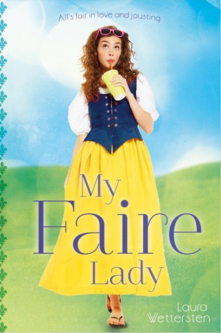
3. My Faire Lady by Laura Wettersten
I guess this cover doesn't fit as well because it isn't a long flowing gown, but it's still a girl in a dress, so I'm including it. I like it, though, because it really fits what the novel is about.
The Covers I'm Neutral About


4. The Selection trilogy by Kiera Cass
I think the backgrounds set these books apart, and the dresses are pretty, but the only cover I truly love is The One.

5. Cinderella's Dress by Shonna Slayton
I'm excited about this book, I truly am, but I feel it's cover is oh-so-typical. I'm not sure I'd pick it up if I didn't know what it was about.

6. Deception's Princess by Esther M. Friesner
The falcon makes this cover pretty cool, and the colors are lovely, but it's nothing out of the ordinary and I feel like they were trying to hard to make the girl look like Merida.

7. A Mad, Wicked Folly by Sharon Biggs Waller
The colors for A Mad, Wicked Folly's cover are stunning, but it's honestly nothing special.
The Covers I Dislike

8. Shatter Me by Tahereh Mafi
Thank goodness they changed Shatter Me's cover. Honestly, the hardcover is nothing special. The theme they changed it to for the rest of the series is much more eye-catching (pun unintentional) and different.

9. The Jewel by Amy Ewing
My main dislike for this cover stems from its similarities to The Selection - the font, the mirrors, the girl in a fancy dress. Especially since it's from the same publisher, you think they'd create something more unique.
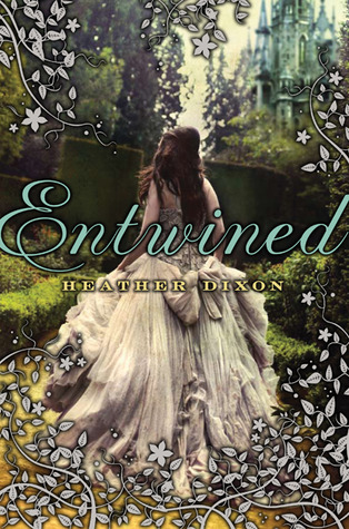
10. Entwined by Heather Dixon
To me, this is seriously one of those typical "girl in a pretty dress" covers. I like the border, but it's not enough to save this cover.

Oh my goodness you're so right about Merida on the Deception's Princess cover! She is the spitting image! Grave Mercy looks really cool!
ReplyDeleteCheck out my TTT!
Katrina @ Chased By My Imagination
One thing with Deception's Princess is, almost all truly Scottish or Irish people have bright, curly red hair and green is the color that looks best with it. It's practically their trademark. For Merida in Brave, they took the typical Old Scottish/Celtic look and used it for her. Same thing with Deception's Princess. Just because it looks like a Disney princess doesn't mean they were trying to copy her.
ReplyDeleteI'm not trying to open a can of worms here, so I apologize if I offended you.
~D. Skye <3
This was a great idea, to pick one cover element and to show ten examples. :) I'm really not a huge fan of the "girl in a pretty dress" trend, but I do really like The Selection trilogy and The Jewel (didn't even realize how similar the covers are until you pointed it out!).
ReplyDeleteI am getting tired of this trend too. At first, I thought they were beautiful, but then every other book cover focused on a girl in a dress. I got tired of it pretty quickly. I think it is a lot like the covers of romance novels with shirtless males. It is so overdone that everyone starts to hate it.
ReplyDeleteMy TTT
You're so right about The Selection trilogy, I find The One has the only really nice dress on the cover. I do though love Entwined's cover I think because I find it reminds me of the fairytale-esque of the story. Nice selection though
ReplyDeleteHere's my TTT
Yes to this! I love Grave Mercy's cover (that bow and arrow) and The Selection trilogy is so pretty. I honestly can look at these for such a long time.
ReplyDeleteOh, I love The Selection covers! (Though I'm kind of bothered by the facial expression and posture of THE ELITE.) And the Shatter Me series is one of the series where I actually approve of the redesign.
ReplyDeleteRachel @ Beauty and the Bookshelf