Usually I'm either indifferent towards or love book covers. But there's a few that I have opinions about or indifferent enough towards that I wish I could redesign (even though I'm not artistic in the slightest).

1. Not Now, Not Ever by Lily Anderson
It's mainly the colors I'd switch up. The yellow is just unappealing and the position of their heads just feels awkward. I'd definitely leave Elliot/Ever and Brandon on the cover in some form, although I'd love to give the cover a little more of a sci-fi/nerd/school-focused look.

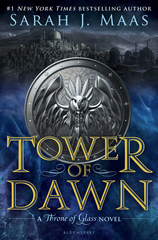
2. Tower of Dawn by Sarah J. Maas
I'd put Chaol in his wheelchair on the cover so it would match the rest of the series.

3. Rules for 50/50 Chances by Kate McGovern
Not entirely sure what I'd do with this one, but I'm not sure the current cover reflects the book's contents well enough.

4. The Weight of Feathers by Anna-Marie McLemore
I love the feel of this cover, but its colors are just a little too off and, compared to Anna-Marie's other covers, it's a little bare. So I'd dress it up a little more and make it really pop.

5. Emmy & Oliver by Robin Benway
It's just so boring. The faint ocean in the background does nothing for it either.

6. Don't Fail Me Now by Una LaMarche
I like the style of Like No Other's cover more, so I'd redesign DFMN to coordinate better with that.

7. 17 First Kisses by Rachael Allen
This book is so much deeper than its cover, so I'd make it reflect that.
What book covers would you redesign and why?
No comments:
Post a Comment